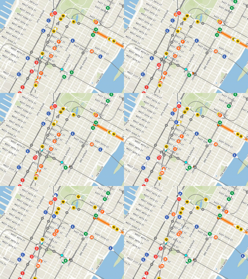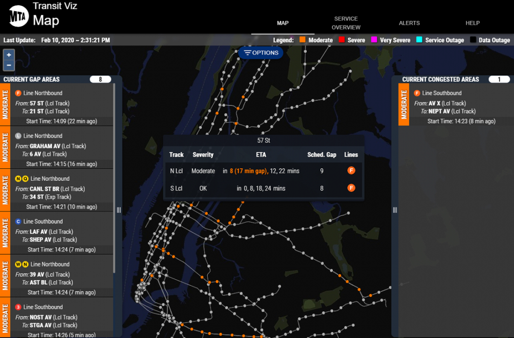
The signal system on NYC Transit’s “B” Division (with the exception of CBTC on L line) was installed in phases during the Great Depression and currently in the process of modernization and would take a few more years. All signals operated on relay logic and it was impossible for the dispatchers in the Operations Control Center (OCC) to monitor the whereabouts of each train or their schedule identity in real time. Mr. Reddy led an interdisciplinary team of signal specialists, programmers and analysts to develop and deploy a system to visualize the real-time train locations with a user-friendly interface. The system kept reading the logical state of relay circuits, and sent track occupancy information to a central server where it was combined with the real-time vehicle data generated by terminal dispatchers, and finally the result was displayed in the web interface for the operators and decision makers as a measurement. This system along with track schematic graphical user interface (GUI) was deployed at two Master Towers where it led to an immediate improvement in dispatcher actions and incident management. It was also deployed at the OCC to enable better management monitoring and for the delivery of accurate real-time train arrival information to customers. Currently it has been used by over 100 personnel from service delivery, signal departments, and as well help digital customer communications teams identify where to put out public delay alerts.

Key Features
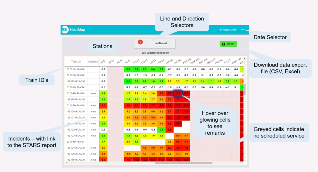
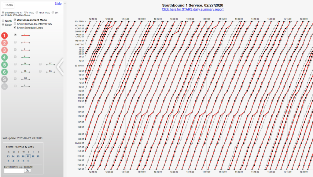
In addition to the Transit Viz map visualization tool, Mr. Reddy also led his team to design and implement other innovation tools for the dispatchers to improve the service efficiency. The heat map was developed for the dispatchers to see detailed and tailored train by train activity for various analyses or real time service adjustments. Another tool, the stringline chart, was developed to compare the movements to schedules and linking slowdowns with associated incidents.


Related Project
Related Publications